Max Prints
Logo Design and Branding
The request was to create a unique logo for a printing business. The owner wanted to stay away from the stereotypical imagery found in print shop logos, like plays on CMYK colors and printing marks. After some creative exploration I presented three options.
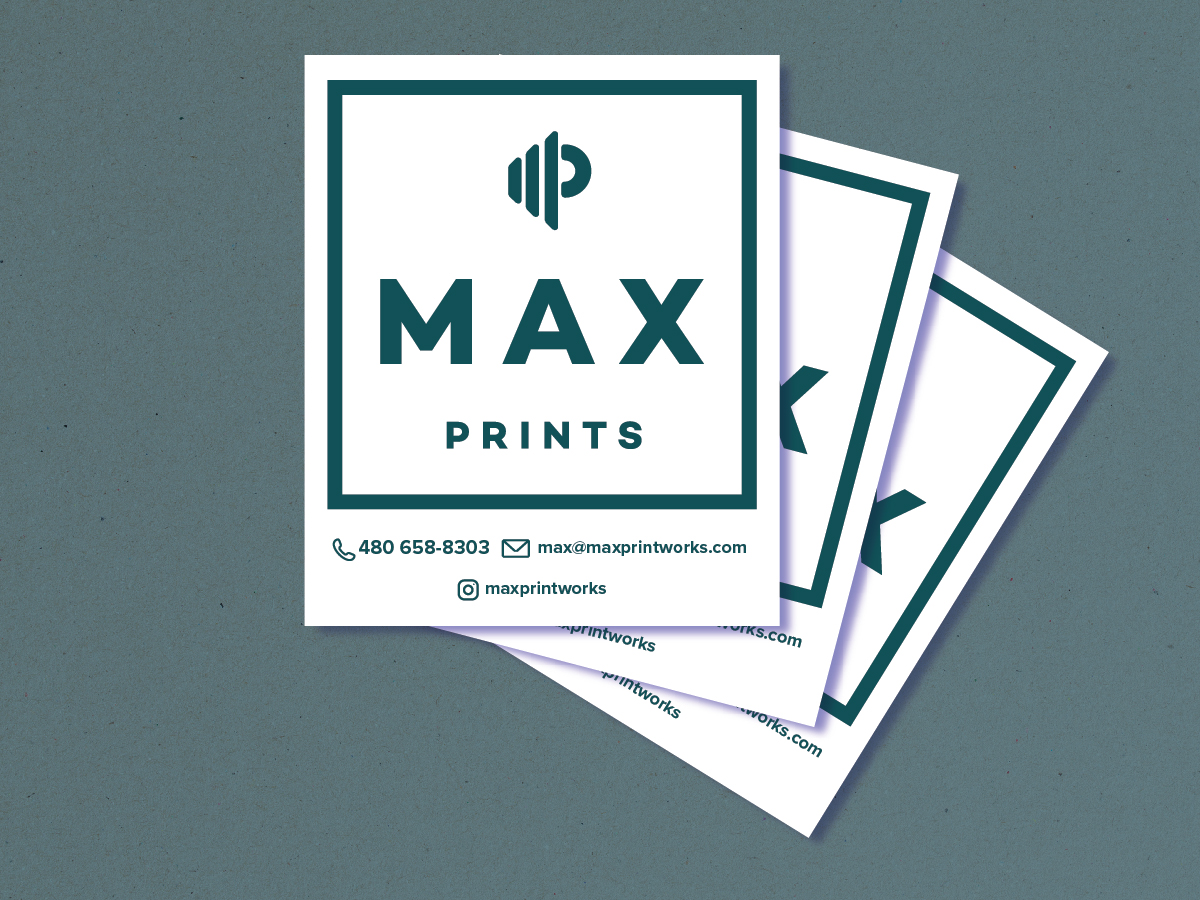
Option one is a modern minimal approach. The logo only uses a minimal amount of line art and bold color to make a statement and is flexible enough to use in a number of branding applications.
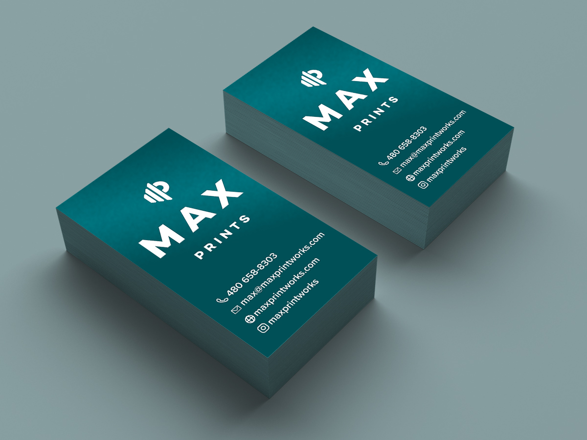
Option two is a modern take on a classic logo style. The logomark is a stylized monogram, and the typography is bold simple and elegant.
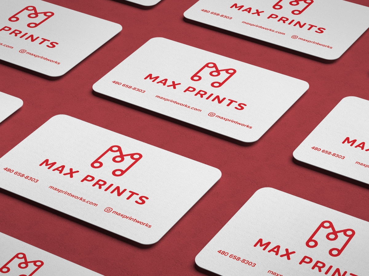
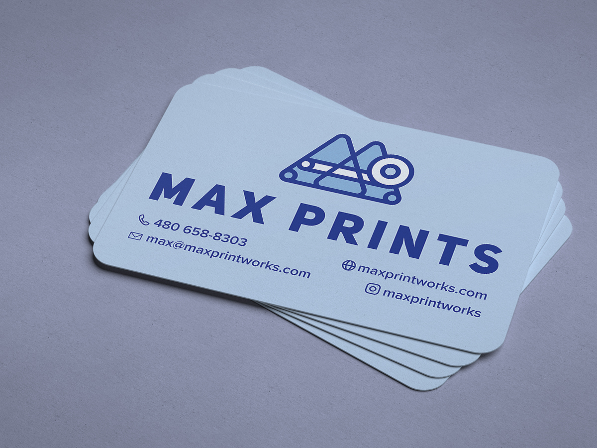
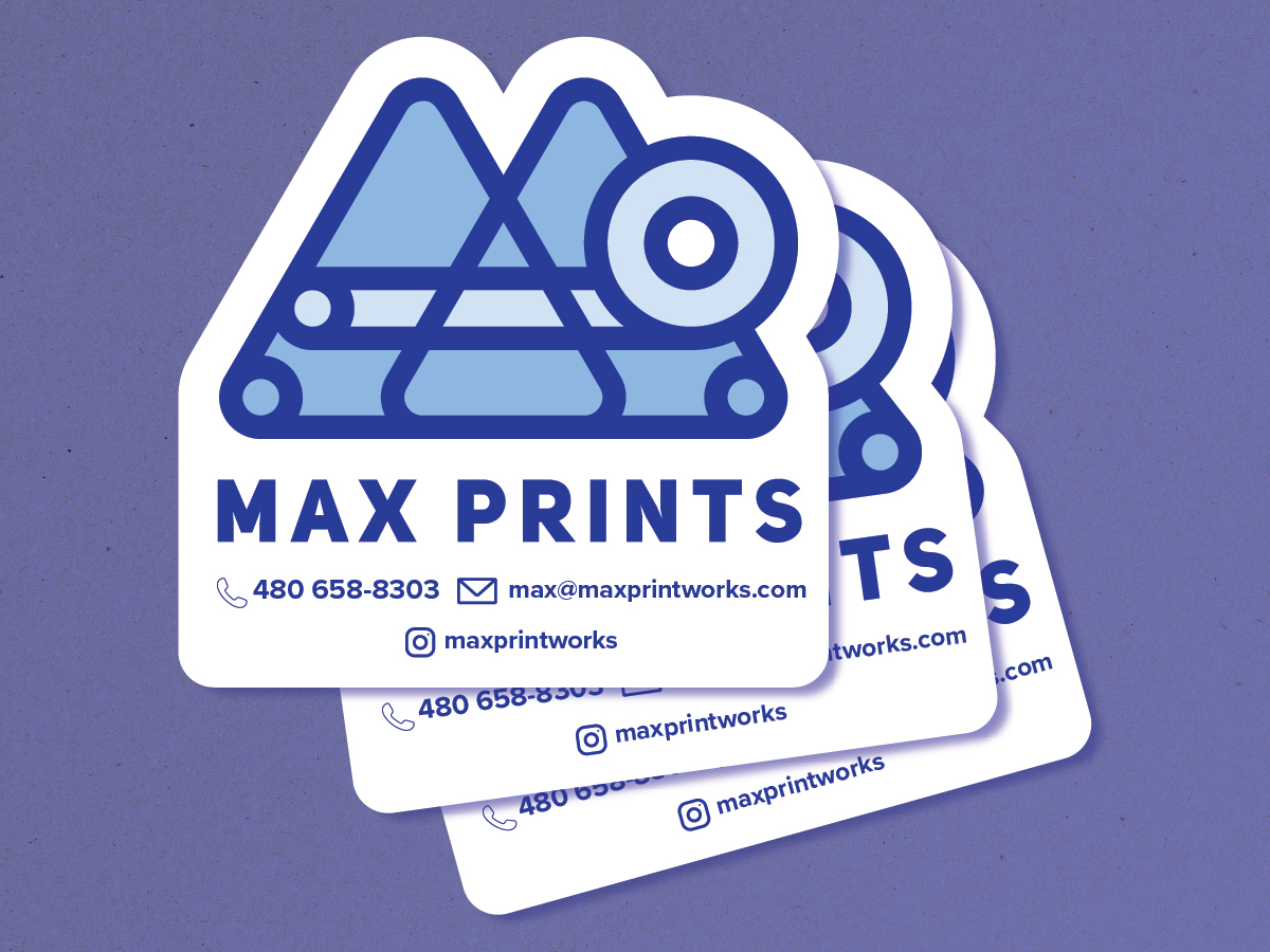
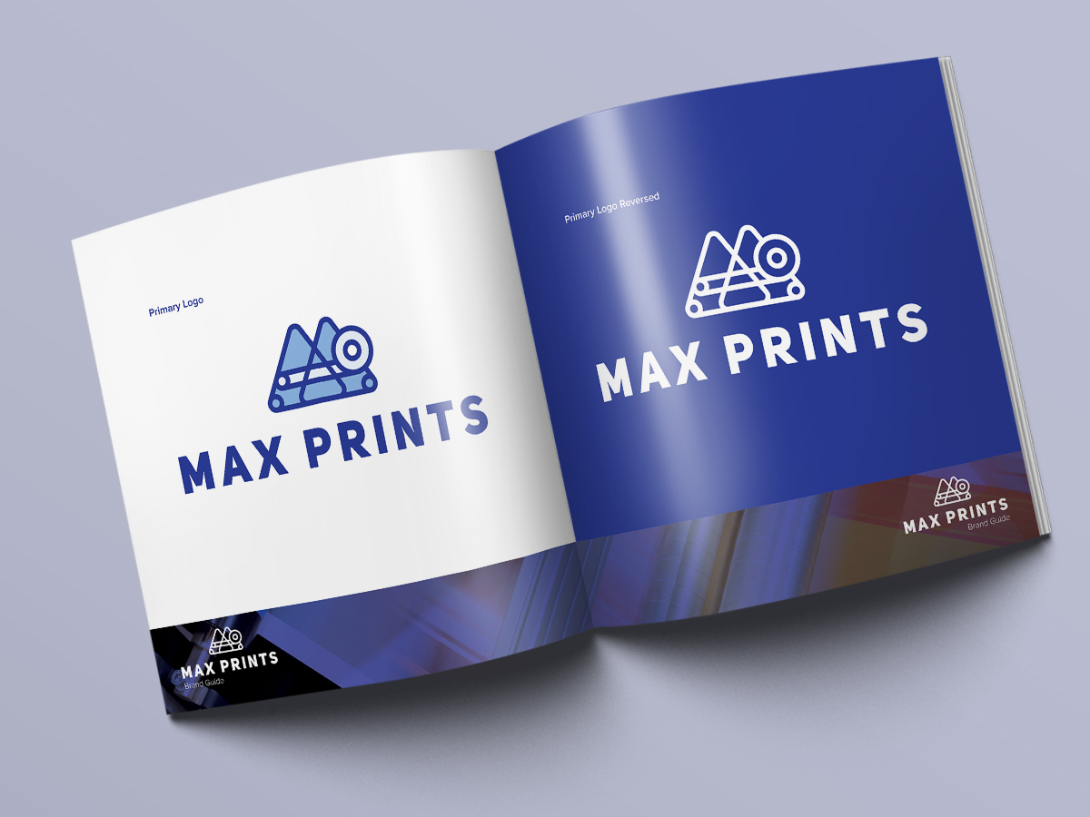
Finally, the logo that was chosen was the abstract shape concept. This concept is inspired by the shapes of paper going through the rollers of a large printer and the initials of the Max Prints business name creating the unique and bold logomark the client was looking for. The thick lines of the mark and typeface are versatile enough to stand alone and together as the usage dictates.
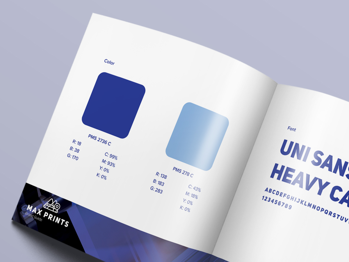
Once the final design was settled, I created a brand standards guide that dictates the primary visual usage of the logo, typography and brand colors. The guide defines and provides context examples of what the brand will look like in various visual outputs, such as print and web.


