Corporate Presentations
Print Design
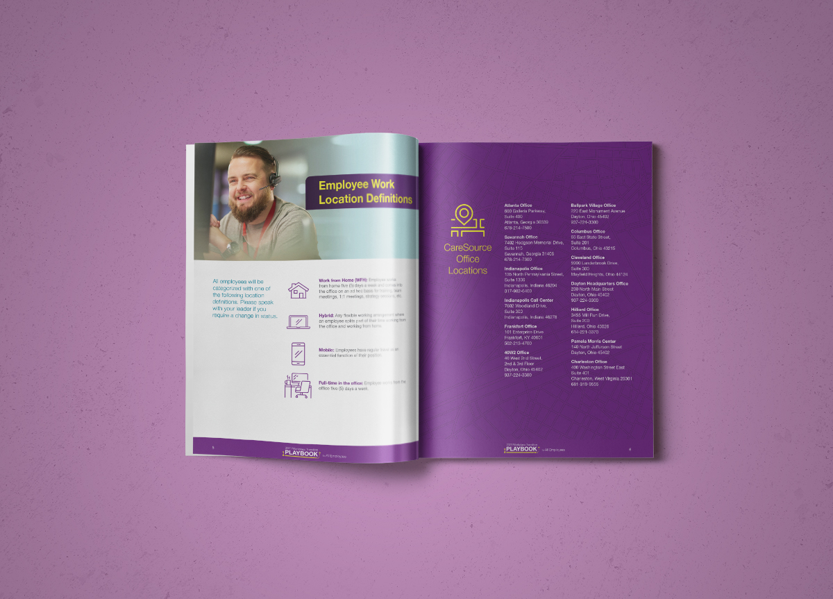
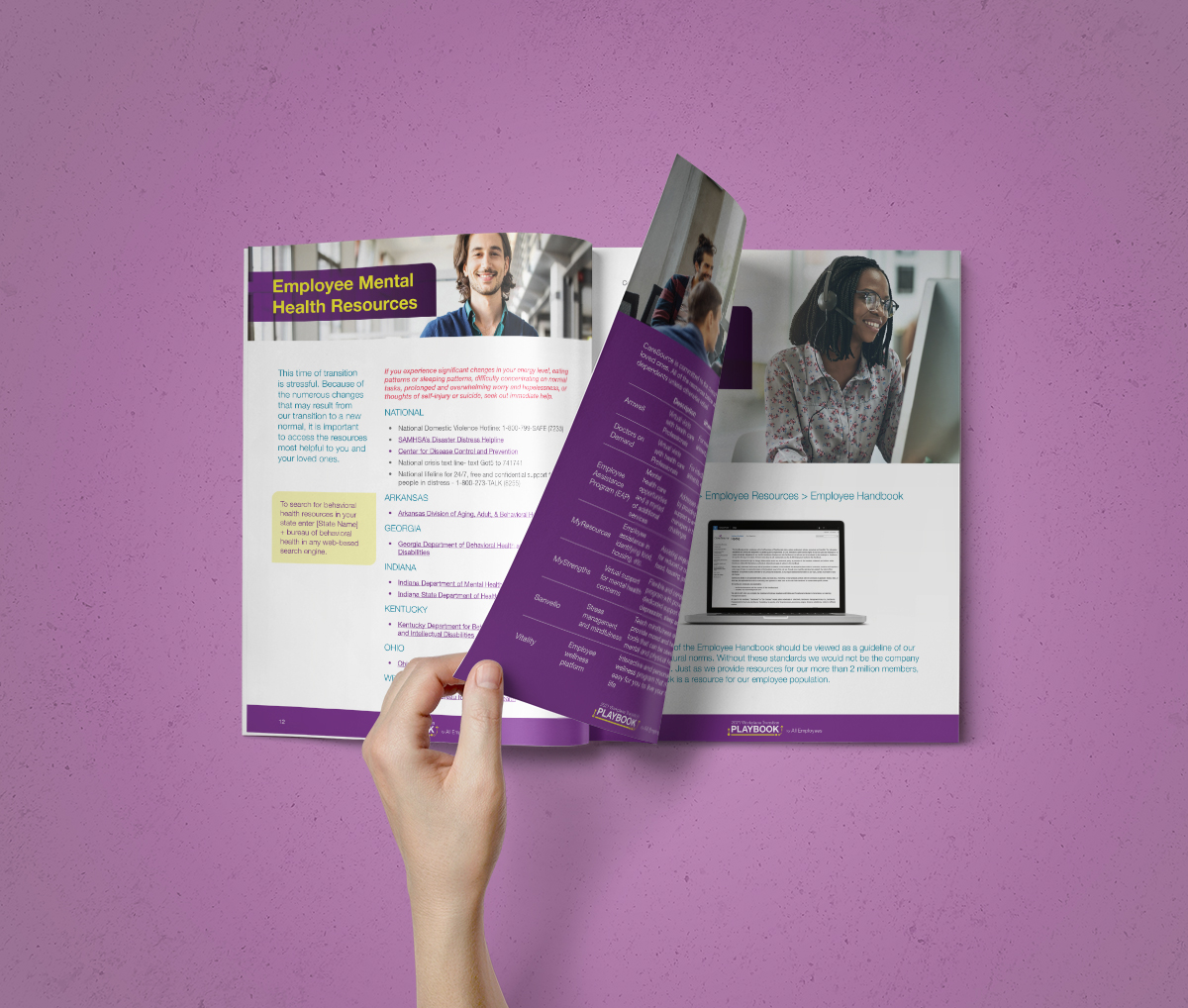
When creating internal corporate communications, it’s important to find the right balance. Internal communications can be filled with corporate jargon, and be a very dense read. The challenge is to get the reader to stay with you and not drift off into a buzzword-induced daydream. My approach has always been to make it as easy to read and pleasing to the eye as possible. I do this by using a minimal clean design, with a lot of iconography, candid diverse photography, and bold colors. Here are a few design examples that I’ve had a hand in creating.


